THE OBJECTIVE
This was an independent project I started to build up my portfolio. For this project, I wanted to focus on print design, because I mostly create digital graphic pieces. I challenged myself to produce labels for print that had specified sizes for a specific design of soap bottles. I also challenged myself to produce my own soap bottle mockups. I wanted to practice producing my own mockup images that were both realistic and versatile.
THE PROCESS
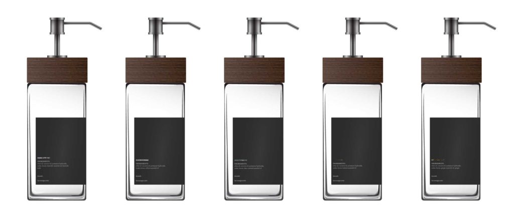
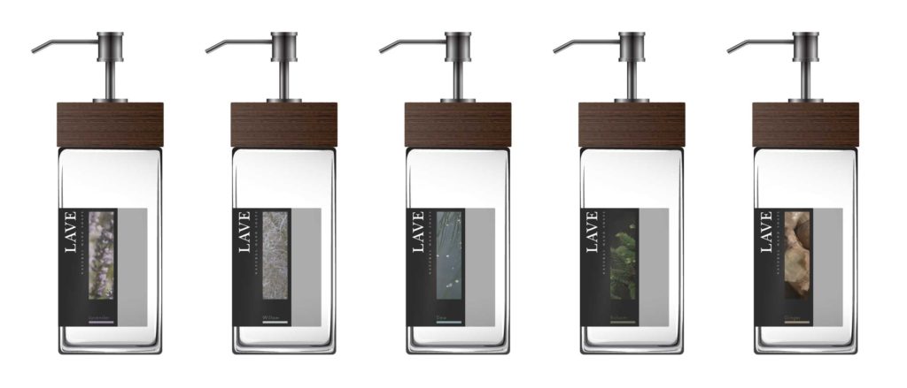
I started planning out and thinking of the dimensions of the soap bottles. I did some research online for typical soap bottle sizes and volumes. I had an image in mind of how I wanted my soap bottles to look like and created a few drafts on Adobe Illustrator. I had trouble making the bottles look realistic and almost turned to 3D programs to get the results I wanted. However, due to the time sensitivity of the project, I decided to stick with Illustrator. In the end, I was happy to find that the glass bottles looked quite realistic! My mockup is definitely not perfect, but I was happy with my results.
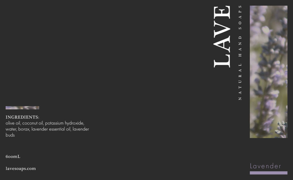
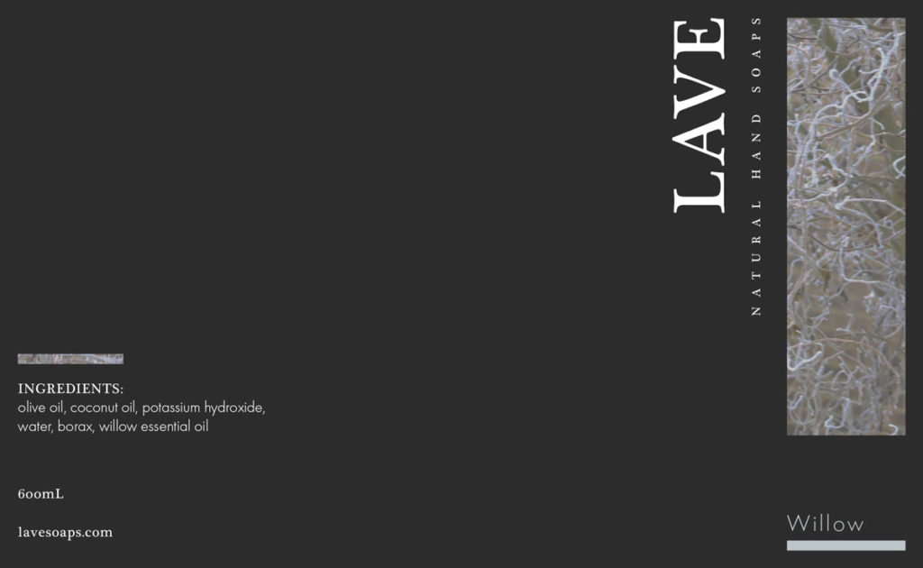
The next step was designing the brand of the soap. The branding was not an important part of this project, so I quickly came up with a name for the brand and created a simple and nice sans-serif logo. The sans-serif font choice matches the brand’s identity of modern design and sophistication.
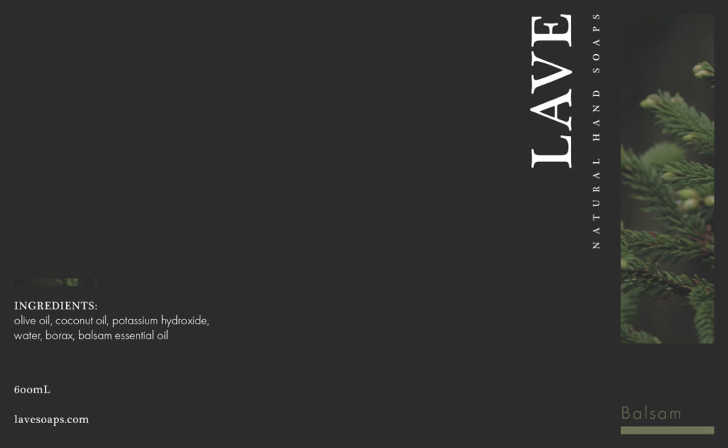
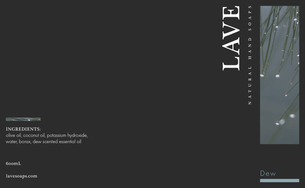
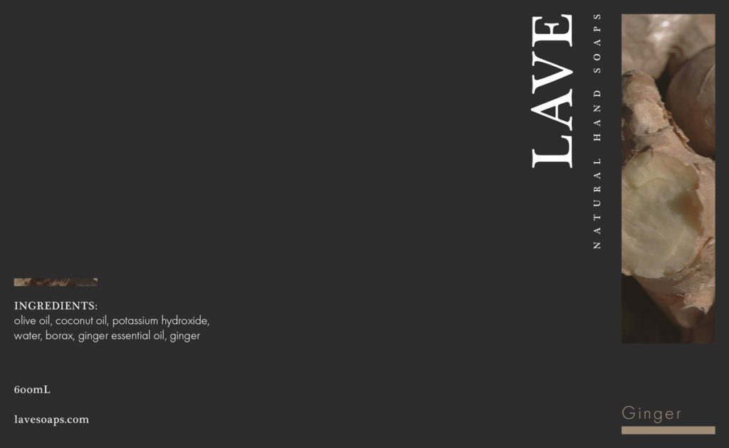
Through the process of designing the labels, I collected imagery through Creative Commons to represent each soap’s scent. I would edit the images to suit the brand before including it in my design. In total, there are five scents of Lave soap: willow, lavender, ginger, balsam, and dew. Each scent has its relationship to nature and a sense of calmness and serenity. The labels were designed with the fundamental principle of simplicity. There is not a lot of information or text on each label to avoid clutter. Only the most important pieces of information are present: the brand, product description, scent name, ingredients, size, and brand information. By keeping information to the bare minimum, I believe it elevates the design and makes it easier for consumers to understand what they are purchasing.