View Dizyn Theory’s website here
The Objective
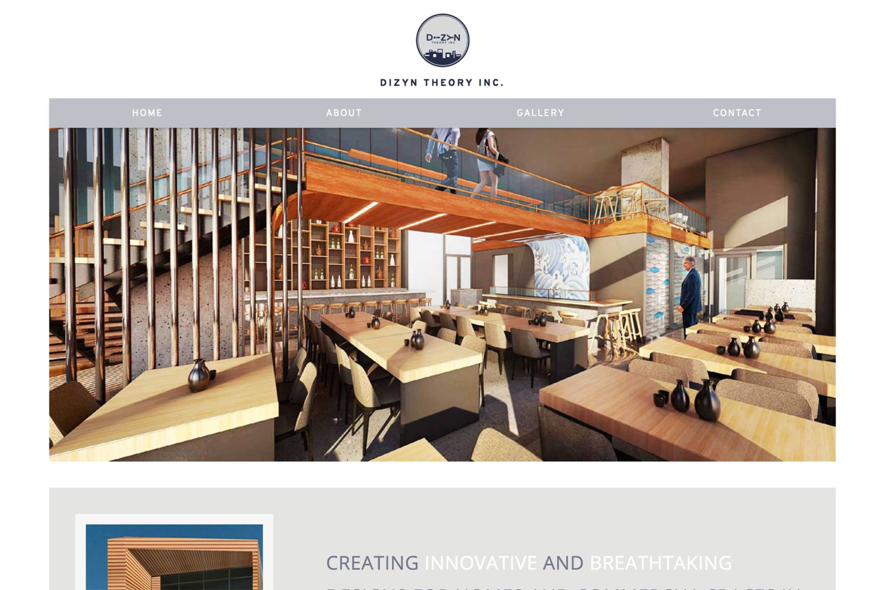
Dizyn Theory came to me looking for a new website. Their old website was outdated and was not professionally developed; they used a website builder in the past. My solution was to create a responsive and clean website for them. The purpose of their website was to offer information and showcase their past work to potential clients. I kept this purpose closely in mind during the development of the website.
The Process
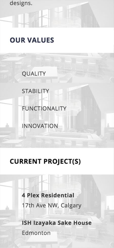
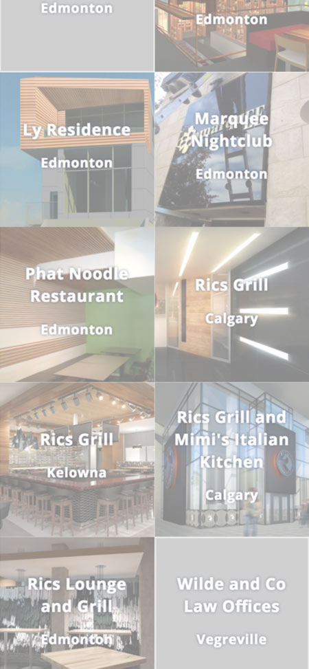
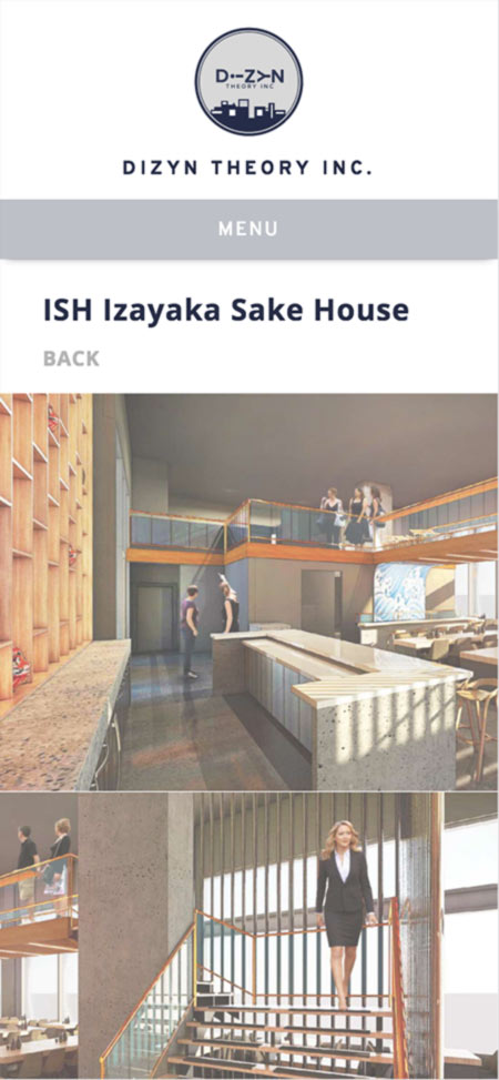
I was offered a lot of creative freedom for this project; there were not many specifications. In general, I needed to use the content from the old website and implement it into a new design. My design objective was to use a lot of imagery because Dizyn Theory is part of the architectural design industry. Architecture is a visual-orientated industry, and the best way to represent a business in that industry is through picture and graphic content. So, I created a large slideshow for the home page, used images as backgrounds, and used minimal text for the gallery.
I wanted to keep the website in tune with Dizyn Theory’s brand, so I used their logo colours for the website. I also used a lot of white to brighten things up. The purpose of creating a lighter theme was to produce a modern and welcoming feel. Also, when lots of imagery is used, it is best to keep colours muted and neutral to prevent disruption.
In the back end of development, I implemented a database for the content of the website including gallery information, project listings, and business descriptions. The database was created using PHP and MySQL. The use of database and content management systems in web development is a standard these days, so it was crucial to include those features where needed.
Responsive design is one of my favourite aspects of web design and development. With the use of media queries in CSS, I made Dizyn Theory’s website fully responsive. Their new website can be viewed seamlessly on any device and any screen size. It is important for their website to be responsive, because their clientele includes a range of individuals who actively use smartphones, tablets, and other mobile devices.
Overall, this project was a great learning experience. I did run into obstacles along the way, but I was able to solve the problems and issues I had. I would say the hardest part of the project was having so much creative freedom; it didn’t give me a thorough guideline and idea of what the client wanted. However, good communication and detailed drafts between both sides helped immensely to give me a better understanding of the client’s needs and goals.